Boosting Nando's Revenue by +£22k in 3 Weeks with Post-Order Menu Shortcuts
Role: Lead Product Designer
Timeline: 7 months
Team: Collaborated with UX researchers, developers, and stakeholders from Nando's operations and marketing teams.
Project Background
What is it about?
The project aims to address and alleviate the issue of long wait times at tills during busy periods in our restaurants. These wait times not only frustrate customers but also divert our ‘Nandocas’ from their essential hosting and restaurant floor duties.
Who is it for?
This process is designed to benefit both our customers and our ‘Nandocas’. For customers, our goal is to create a more seamless and enjoyable dining experience. For our ‘Nandocas’, it's about enabling them to focus more on their core responsibilities of hosting and managing the restaurant floor, thereby improving overall efficiency and job satisfaction.
Why is it important?
Reducing wait times at the tills is crucial for enhancing customer satisfaction and loyalty. By freeing our ‘Nandocas’ from till duties during peak hours, we ensure that they can provide the best possible service on the restaurant floor. This not only leads to a better dining experience for customers but also improves operational efficiency, staff morale, and ultimately, the overall success of our restaurants.
Research and Analysis:
To thoroughly understand the pain points experienced by both customers and ‘Nandocas’, we conducted extensive generative research. This involved direct feedback from our customers and in-depth interviews with our ‘Nandocas’. Through this research, we identified key areas of frustration and operational bottlenecks. We then synthesised this data into an affinity diagram, enabling us to identify the key areas for improvement and guide our solution development.
Problem Statement
Challenge:
Customers eating in our restaurants often face long wait times at the tills during peak hours. This issue not only leads to customer frustration but also requires our ‘Nandocas’ to manage the till, diverting their attention from essential hosting and restaurant floor duties. This dual strain negatively impacts both customer satisfaction and staff efficiency.
Objective 1:
Goal: Improve the quality of our Eat In digital ordering journey.
Primary KPI: Conversion Rate
Secondary KPIs: OPAT Share, Order Frequency, Customer Feedback
Objective 2:
Goal: Increase the revenue generated through our Eat-in digital ordering journey.
Primary KPI: Digital Ordering Revenue
Secondary KPIs: Revenue Per User, AOV, Spend Per Head
Metrics to Measure Our Success:
Grow Web CVR from 67% ➡️ 70%.
Grow OPAT share from 42% ➡️ 47%
Grow Web CSAT from 69% ➡️ 72%
Grow AOV of OPAT by 2.5%

Research
Following the Double Diamond design process shown here, I led an extensive exploration to understand and improve Nando's eat-in digital ordering journey. The Double Diamond guided us through two phases: Discover and Define, ensuring a comprehensive approach to identifying and addressing user needs.
Discover Phase: During this phase, we used various methods to gather insights and uncover the core issues faced by users and staff.
Generative Research: We interviewed 36 regular customers to gather detailed insights into their experiences, preferences, and frustrations with the current system. These interviews helped us identify key themes and pain points.
Affinity Diagram: We organised the information from the interviews using an affinity diagram, which helped us spot common patterns and prioritise the most critical issues.
Secondary Research: We analysed data from our internal data lakes, including order histories and customer feedback, to understand usage patterns and common problems.

Key Findings
-
22 out of 36 respondents prefer ordering via Order Pay At Table (OPAT) due to reasons like language barriers, social anxieties, or feeling rushed at the till.
"English isn't my first language which is an issue because OPAT isn't good for first time users for foreigners.”
Customer, Gloucester Road
-
18 out of 36 respondents haven't downloaded the app, with 5 customers and 2 restaurant staff citing a lack of incentive.
"I'd more inclined to use OPAT if I got rewards for engaging with it.”
Customer, Gloucester Road
-
17 out of 36 respondents feel there's insufficient messaging about using the QR code or how to do it.
"I would prefer to use OPAT but wasn't aware of it on the table (even though it was on the table).”
Customer, Westfield City
-
15 out of 36 respondents believe OPAT doesn't provide enough feedback, making them feel unconfident.
"Customers don't know when their food or drinks will arrive.”
Nandoca, Balham
-
15 out of 36 respondents are unaware of Nando's Rewards or are aware but uninterested.
"I thought you could only collect rewards at the till.”
Customer, Westfield Shepherd’s Bush
-
12 out of 36 participants prefer ordering at the till to speak with restaurant staff while 10 out of 36 participants go to the till mainly to modify their order by talking to someone.
"Customers typically customise their order on OPAT and only after go and notify staff - we then have to go and update the kitchen.”
Nandoca, Westfield Shepherd’s Bush
Affinity Diagram
To organise and synthesise the qualitative data from our customer and Nandoca interviews, we used affinity diagramming. This method involved categorising individual insights and observations into broader themes and patterns. By grouping similar pieces of information together, we were able to identify common issues and prioritise them based on their frequency and impact.
Why are we doing this?
Clarity and Focus: It provided a clear visual representation of the data, making it easier to understand complex information and focus on the most critical issues.
Collaboration: The process facilitated collaboration among team members, allowing everyone to contribute to and engage with the data.
Prioritisation: By visually clustering similar insights, we could quickly identify and prioritise the most pressing pain points that needed to be addressed.
User-Centred Insights: The method ensured that our design decisions were deeply rooted in real user experiences, leading to more relevant and effective solutions.
Ideation
With a clear understanding of the pain points and challenges from our research, we transitioned into the Ideation phase of the Double Diamond process. This phase was critical for generating innovative solutions and ideas to address the identified problems. We conducted a series of collaborative workshops to harness the collective creativity and expertise of our team and stakeholders.
How Might We Workshop:
The first workshop we conducted was a "How Might We" (HMW) session. This technique is designed to reframe challenges into opportunities for design. We started by breaking down our key insights and pain points into specific, actionable questions that began with "How might we...". For example, "How might we reduce wait times for orders?" or "How might we make the digital ordering interface more intuitive?"
How Might We Workshop Introduction
In this "How Might We" workshop, we gathered to tackle the challenges encountered by our customers and ‘Nandocas’ in our restaurants. Through collaborative brainstorming and creative problem-solving, we aimed to generate actionable "How Might We" statements to guide the design of effective solutions. Let's dive in and explore innovative ways to enhance the dining experience and streamline operations!
-
How might we provide a restaurant experience that caters to all types of customer so they feel confident when dining with us?
How might we make the order process more simplified so customers feel confident placing an order?
How might we might we make the web experience less cluttered so that customers feel more comfortable navigating it?
-
How might we take the QR code more visible?
How might we make it obvious to notice QR codes and their purpose?
How might we better signpost the journey, so we don't rely on Nandocas?
-
How might we set expectations to customer on what to expect?
How might we provide an estimate on how long the journey will take?
How might we keep customers updated as their order progresses?
-
How might we have the option to sign up to loyalty when create an ID?
How might we show available rewards when building a basket?
How might we encourage customers to log in before checkout?
-
How might we make customers feel special when using OPAT?
How might we provide virtual interaction with a human?
How might we gain an insight into what the most popular customisations are?
Brain-writing Workshops
Following the HMW session, I conducted two brain-writing workshops to generate a large volume of ideas quickly. Unlike traditional brainstorming, where participants verbalise their ideas, brain-writing involves writing down ideas individually and then sharing them with the group. This method helps to minimise the influence of dominant voices and allows for more diverse input.
Facilitation and Participants:
I facilitated the brain-writing workshop, which included a diverse mix of designers, business managers, project managers, and stakeholders from across the customer and tech teams. This diversity ensured a rich variety of perspectives and expertise, fostering more comprehensive and innovative solutions.
The process of the workshop
Individual Idea Generation: Each participant wrote down their ideas on a given topic or problem without discussing them initially.
Sharing and Building: Ideas were then passed around or displayed, allowing others to build on them, add new thoughts, or refine existing ones.
Consolidation: We collected all the ideas and grouped similar ones together, identifying the most promising concepts to explore further.
Brain-writing Synthesisation
Through these workshops, we generated a wide range of ideas and potential solutions. This collaborative ideation process was instrumental in ensuring that our solutions were not only innovative but also feasible and aligned with the needs of both users and stakeholders. The insights and ideas gathered from these sessions set the stage for the subsequent design and testing phases, guiding us toward creating a more efficient and user-friendly digital ordering journey for Nando's.
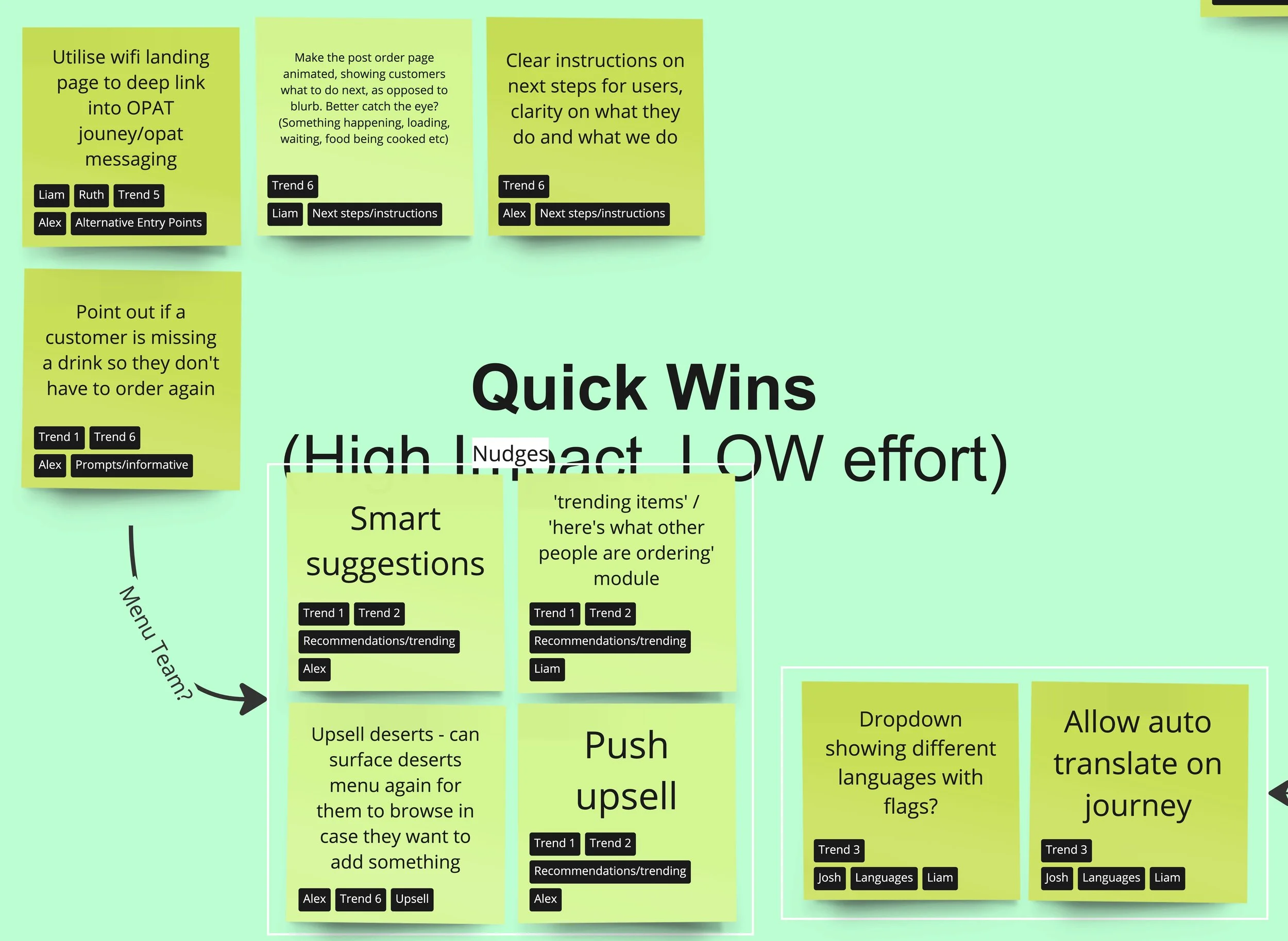
Top Optimisation Areas (Selected by the Team):
Managing Expectations of a Customer's Order: How might we effectively manage customers' expectations regarding their orders?
Alternative Entry Points: How might we provide alternative entry points to enhance user accessibility and navigation?
Customisation: How might we offer customisable options to meet individual preferences and needs?
Increasing Confidence on the Post-Order Page: How might we increase user confidence on the post-order page to ensure a seamless experience?
Shortcuts: How might we implement shortcuts to simplify the user journey and improve efficiency?
Prioritisation
After generating a wealth of innovative ideas, the next step was to prioritize them to ensure we focused on the most impactful and feasible solutions. I led a workshop with key stakeholders using the RICE scoring method, which evaluates ideas based on Reach, Impact, Confidence, and Effort.
Benefits of the Workshop:
Objective Decision-Making: RICE scoring provided a clear, quantifiable way to evaluate ideas.
Stakeholder Buy-In: Involving stakeholders ensured the final prioritization reflected diverse perspectives and gained broad support.
Focused Effort: Prioritising ideas allowed us to focus on the solutions most likely to deliver significant value.
Leading this prioritisation workshop was crucial in ensuring our design efforts were strategically aligned with the goals and needs of Nando's customers and the business. The prioritised list of ideas set a clear direction for the next phases, guiding us toward creating a more optimised and user-friendly digital ordering journey.
Prioritisation Workshop
I organised and facilitated the workshop with a diverse group of stakeholders, including designers, business managers, project managers, and representatives from both customer and tech teams. Our goal was to collaboratively evaluate and prioritise the ideas from the ideation sessions.
-
I started with a presentation on the RICE scoring method, explaining each criterion:
Reach: How many people an idea will affect.
Impact: The potential impact on each person, rated on a scale.
Confidence: The certainty of our estimates, rated on a scale.
Effort: The amount of work required to implement the idea.
-
We divided into smaller groups to discuss and assign RICE scores to each idea. This collaborative process ensured diverse perspectives were considered.
-
Each group calculated the RICE score for their ideas using the formula. This helped quantify the potential value of each idea.
-
We reconvened as a whole group to discuss the results. Each group presented their top-scoring ideas, and we collectively reviewed and validated the scores.
-
Based on the RICE scores and group discussions, we created a prioritised list of ideas. This list highlighted the most promising solutions to move forward with.
Targeting Quick Wins
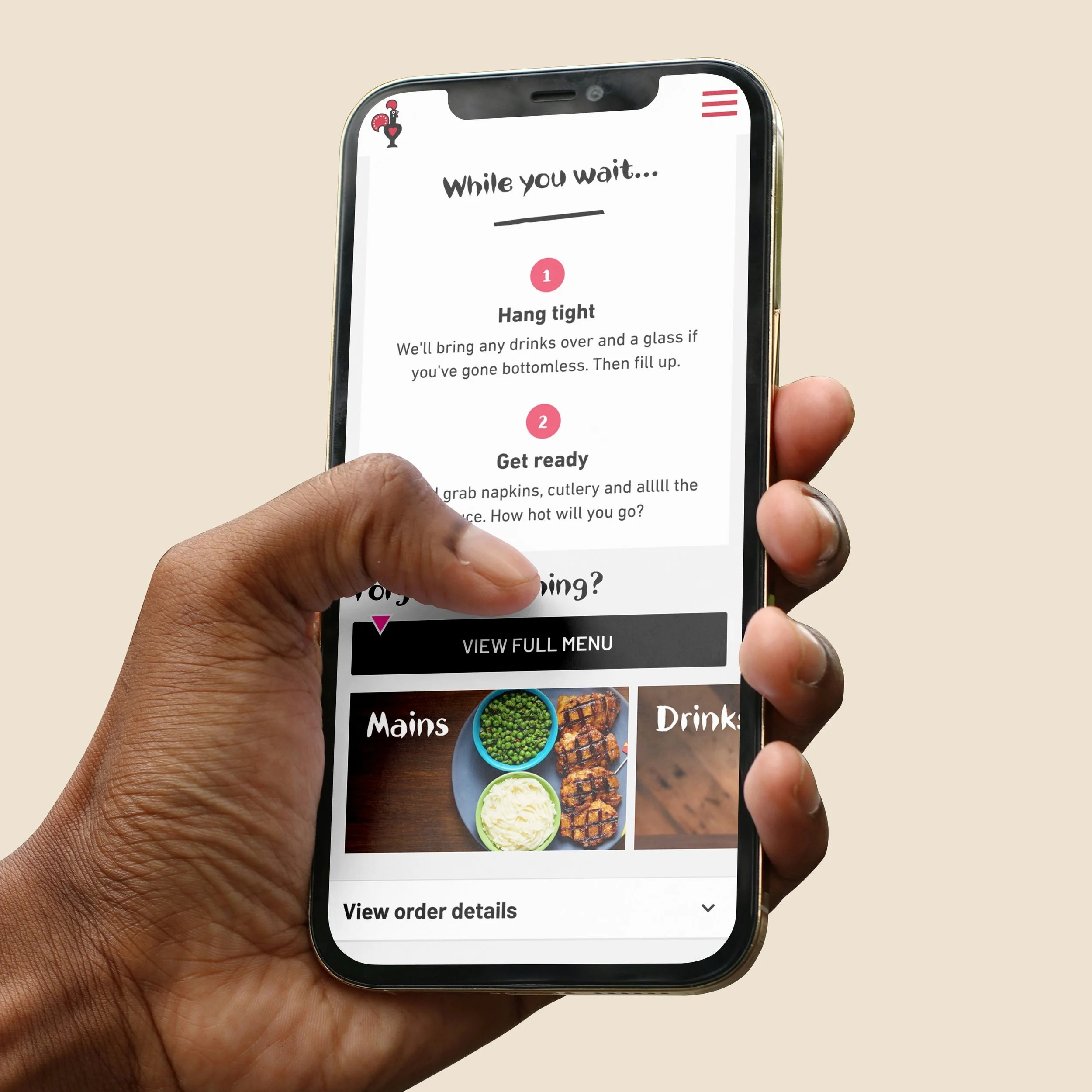
Moving into the design phase, we decided to focus on the high-impact, low-effort areas. With a prioritised list of such ideas, we transitioned into the Design phase of the Double Diamond process. This phase aimed to transform our top ideas into tangible solutions through iterative design and prototyping. Our goal was to create a seamless and user-friendly post-order experience that addressed the key pain points identified during our research. These included customers feeling they didn't receive enough feedback about their orders, such as time estimates, and the need to give users more control to foster confidence on the post-order page.
Design Approach
We adopted a collaborative and iterative approach, involving continuous feedback loops and stakeholder engagement to refine our designs. This ensured that our solutions were both innovative and practical.
Wireframing: We started by creating low-fidelity wireframes to outline the basic structure and layout of the new digital ordering interface. These wireframes served as the blueprint for our design.
Prototyping: Next, we developed high-fidelity prototypes to provide a more detailed and interactive representation of the final product. These prototypes allowed us to test and validate our design concepts.
User Testing: We conducted usability testing sessions with real users to gather feedback on the prototypes. This helped us identify any usability issues and refine the design accordingly.
A/B Testing: Based on user feedback and after re-reviewing the priority matrix we went onto A/B testing with the best features in line with these criterions.


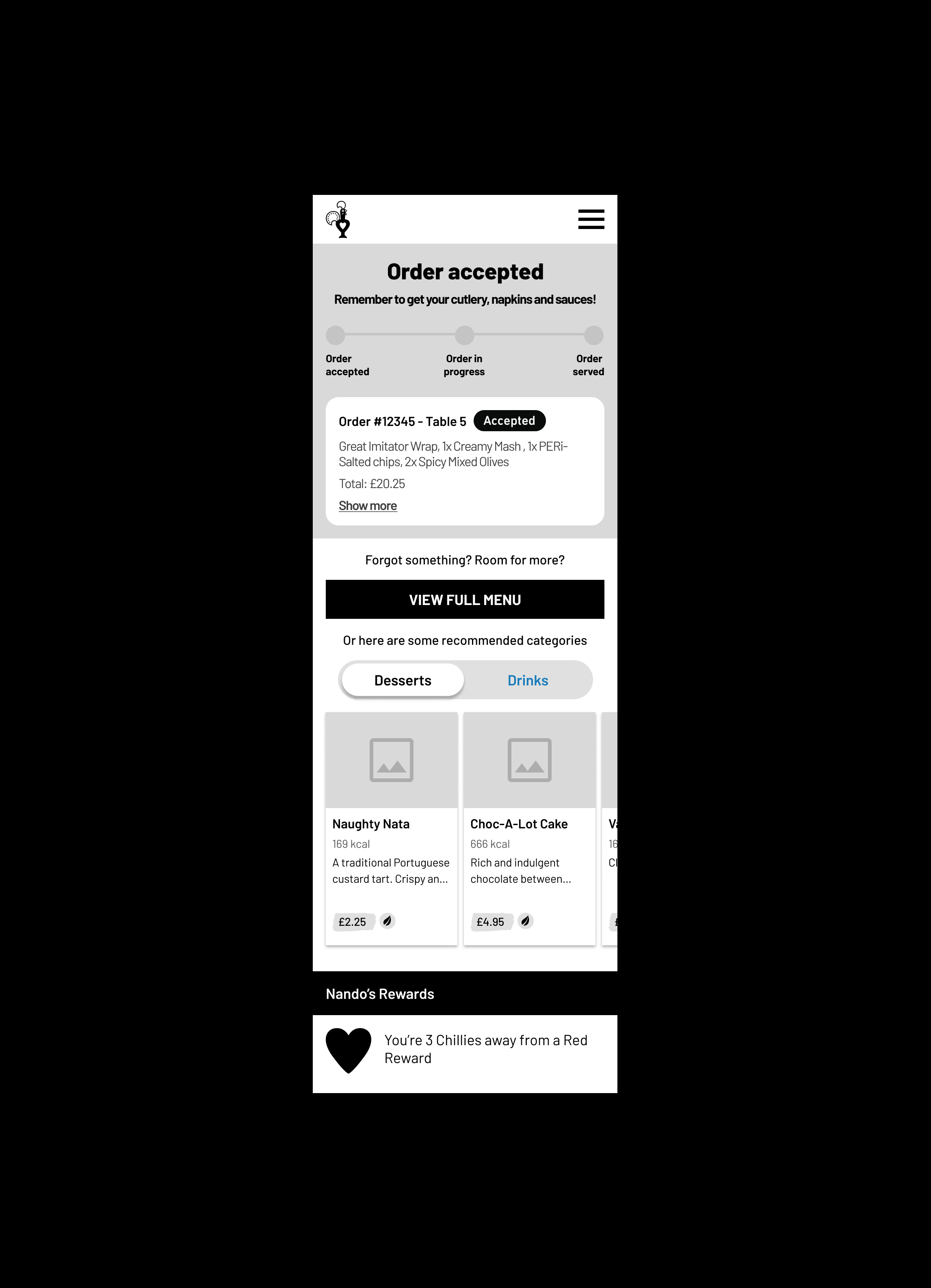
Wireframe Prototype
Next, I developed a high-fidelity prototype to offer a detailed and interactive preview of the final product. These prototypes allowed me to conduct feasibility sessions with our A/B testing partner team effectively. This, in turn, facilitated the swift and efficient creation of a robust test plan, enabling us to proceed with testing and validating our design concepts.
Usability Testing
With our designs refined and ready for evaluation, I moved into the Testing phase. This phase was crucial for validating our solutions and ensuring they effectively addressed the identified pain points, especially the need for enhanced user feedback during the ordering process.
Before launching broader tests, I ran usability testing sessions to gather user feedback on our prototypes. These sessions involved real users interacting with the new menu shortcuts and providing insights into their experiences. The key objectives of these tests were to identify any usability issues, assess the intuitiveness of the new features, and ensure the enhancements met user needs.
Key findings from Usability Testing:
🔎 Customers found the new menu shortcuts intuitive and easy to navigate.
🔎 Customers expected order tracking information on the post-order page.
🔎 Customers expected to see order history information via the menu button.
🔎 Customers had mixed understanding of the ‘Order again’ button.

Order Tracking
A key insight from usability testing was that most customers expected to see order tracking information on the post-order page. Users expressed a strong preference for having a clear and visible order tracking feature that provided updates on the status of their order, including preparation and estimated delivery times. This finding highlighted the importance of transparency and continuous communication in enhancing the user experience.
“I was maybe thinking about like just give me how much time it's going to take over here somewhere to help the just to see how much time wait time it is.”
Userlytics Participant
Menu Shortcuts
Most users reordered using the post-order page menu shortcuts rather than the ‘View Full Menu’ button. Additionally, users generally expected to see suggested items after placing an order rather than in the basket, as their primary objective in the basket is to review their order before proceeding to payment.
“I would prefer to see the suggested items after my ordered items or the items I've chosen.”
Userlytics Participant
“More people would add items if they forgot something, such as a drink or a dessert, later on. So it's good that there's a shortcut available for this.”
Userlytics Participant
“I was expecting that if I'd forgotten an item, there would be a period of time to add it. Similar to ordering food from a supermarket, you usually have a window of time after placing the order to amend the basket and add certain items.”
Userlytics Participant
Order History
Another key insight from usability testing was that most customers expected to see order history information on the post-order page, accessible via a menu button. Users expressed a strong preference for having a convenient and easily accessible order history feature. This would allow them to review previous orders, reorder favourite items, and track their ordering habits. Many users mentioned that they naturally looked for an order history option in the menu after completing their orders, indicating a need for better visibility and accessibility of this feature.
“I would click on this button here at the top right. (…) I would expect to be able to click there and then click on and have a button that says my orders or something like that.
Userlytics participant
“I don't know how I would find my original order. So I'm clicking this hoping to open the menu.”
Userlytics participant
Unlocking Success: Selecting Findings for A/B Testing
After conducting usability testing, we needed to determine which findings to prioritize for A/B testing. This involved evaluating feedback and data to identify the most impactful improvements.
Considerations for Selection:
Pain Points: I focused on findings that address key pain points from our research.
User Demand: Frequently requested features during usability testing.
Technical Feasibility: I assessed how easily each finding can be implemented with current technology and resources at Nando’s.
Business Feasibility: I considered how each finding aligns with business goals, like increasing order completion rates.
Usability Test Feedback: Findings with strong positive feedback are more likely to be selected. Users found the new menu shortcuts intuitive and efficient.
Process of Selection:
Review and Synthesis: I thoroughly reviewed all data and feedback from usability testing.
Prioritisation Workshop: I referred back to the prioritisation matrix workshop I conducted with key stakeholders (shown left) where we discussed and prioritised pain points/ideas using the RICE scoring method (Reach, Impact, Confidence, Effort).
Unlocking Quick Wins: Shifting Focus to Upsell Strategies
In our Prioritisation Workshop, our project direction underwent a significant shift towards low-effort, high-impact solutions. Here's the breakdown:
🎯 Order Tracking Decision (🔴): While acknowledging the potential of A/B testing order tracking to enhance the quality of our Eat-in digital experience, we opted against it due to the complex implementation process.
🎯 Order History Decision (🔴): Similarly, we decided not to pursue A/B testing for order history, as it wouldn't significantly impact user experience or our overarching goals.
✅ Menu Category Shortcuts Decision (🟢): Instead, our focus veered towards testing menu category shortcuts. Why? Because they promised to streamline user interactions with minimal implementation efforts. This choice perfectly aligns with our objective of boosting revenue through digital ordering platforms.
🚀 Unlocking Quick Wins
In essence: Our strategy is all about harnessing quick wins that not only enhance user experience but also align closely with our business goal of increasing revenue, particularly through post-order upsell strategies. See below my UI work which was based on this strategy.

Concept

Concept

Concept

Test Group 2 (Variant)
Final A/B Testing UI & Prototype
Next, I developed a high-fidelity prototype to offer a detailed and interactive preview of the final product. These prototypes allowed me to conduct feasibility sessions with our A/B testing partner team effectively. This, in turn, facilitated the swift and efficient creation of a robust test plan, enabling us to proceed with testing and validating our design concepts.
A/B Test Planning
Building on the insights from our usability tests, we proceeded with A/B testing to compare the performance of the new menu shortcuts against the existing user experience. Over a three-week period, we ran a series of A/B tests to 100k users to measure the effectiveness of the new features in a live environment.
A/B Testing Setup:
Test Group 1 (Control): Users interacted with the existing digital ordering interface without the new menu shortcuts.
Test Group 2 (Variant): Users interacted with the updated interface featuring the new menu shortcuts and enhanced feedback mechanisms.


Hypothesis:
Adding direct category links to the Post Order page will make it easier for visitors to find exactly what they want for a second order, ultimately increasing category link visibility and re-order rates.
Metrics Evaluated:
Repeat Conversion Rate
Repeat AOV
Repeat Revenue per Session
Repeat Revenue per User
Time to Reorder
A/B Test Outcome
A/B Test Revenue (3 Weeks):
Control: £34,650
Variant: £57,420 (+£22,770)
Yearly Revenue Projection:
Control: £602,333.33
Variant: £995,280.00 (+£392,946.67*)
*These projections are based on the assumption that the trends observed in the 3-week test period remain consistent throughout the year. Actual results may vary based on various factors such as seasonality, marketing campaigns, and changes in customer behaviour.
A/B Test Metrics
Analysis of Test Metrics and Performance Evaluation
-
Test Group 1 (Control)
Sessions: 18,000
Users: 15,500
Re-order Transactions: 1,000
Re-order Revenue: £11,000
Re-order Conversion Rate: 6.45%
Re-order AOV: £11
Re-order Revenue per Session: £0.61
Re-order Revenue per User: £0.71
Time to Reorder: 3 minutes 11 seconds
Test Group 2 (Variant)
Sessions: 19,914
Users: 17,355
Re-order Transactions: 1,735
Re-order Revenue: £19,085
Re-order Conversion Rate: 10%
Re-order AOV: £11
Re-order Revenue per Session: £0.96
Re-order Revenue per User: £1.10
Time to Reorder: 2 minutes 3 seconds
-
Test Group 1 (Control)
Sessions: 18,500
Users: 16,000
Re-order Transactions: 1,050
Re-order Revenue: £11,550
Re-order Conversion Rate: 6.56%
Re-order AOV: £11
Re-order Revenue per Session: £0.62
Re-order Revenue per User: £0.72
Time to Reorder: 3 minutes 10 seconds
Test Group 2 (Variant)
Sessions: 20,000
Users: 17,400
Re-order Transactions: 1,740
Re-order Revenue: £19,140
Re-order Conversion Rate: 10%
Re-order AOV: £11
Re-order Revenue per Session: £0.96
Re-order Revenue per User: £1.10
Time to Reorder: 2 minutes 2 seconds
-
Test Group 1 (Control)
Sessions: 18,700
Users: 16,200
Re-order Transactions: 1,100
Re-order Revenue: £12,100
Re-order Conversion Rate: 6.79%
Re-order AOV: £11
Re-order Revenue per Session: £0.65
Re-order Revenue per User: £0.75
Time to Reorder: 3 minutes 9 seconds
Test Group 2 (Variant)
Sessions: 20,100
Users: 17,450
Re-order Transactions: 1,745
Re-order Revenue: £19,195
Re-order Conversion Rate: 10%
Re-order AOV: £11
Re-order Revenue per Session: £0.96
Re-order Revenue per User: £1.10
Time to Reorder: 2 minutes 1 second
-
Test Group 1 (Control)
Week 1 Re-order Revenue: £11,000
Week 2 Re-order Revenue: £11,550
Week 3 Re-order Revenue: £12,100
Test Group 2 (Variant)
Week 1 Re-order Revenue: £19,085
Week 2 Re-order Revenue: £19,140
Week 3 Re-order Revenue: £19,195
Key Takeaways
Insights and Learnings Extracted from the A/B Test Results
-
Control: £34,650
Variant: £57,420
Difference: +£22,770 higher revenue in the variant group
The variant group, which included menu category shortcuts, showed a significant increase in revenue compared to the control group. This indicates that the introduction of menu category shortcuts has a positive impact on driving additional orders through the web app.
-
Control: 6.45% to 6.79%
Variant: Maintained at 10%
The variant group consistently maintained a higher repeat order conversion rate of 10% throughout the test, while the control group showed conversion rates ranging from 6.45% to 6.79%. This demonstrates that the menu category shortcuts helped in improving user engagement and encouraging repeat orders.
-
Control: 3 minutes 11 seconds to 3 minutes 9 seconds
Variant: 2 minutes 3 seconds
The variant group experienced a shorter time to reorder, with an average of 2 minutes 3 seconds, compared to the control group, which ranged from 3 minutes 11 seconds to 3 minutes 9 seconds. The quicker reordering process in the variant group suggests that the menu category shortcuts facilitated a smoother and more efficient user experience.
-
Variant: The first three categories account for at least 80% of category clicks
This shows we can influence users to clicking certain categories if we show them prominent on page load and don’t ask them to go searching. This represents a possibility of testing specific products and potentially new categories in the future.
-
Control & Variant: Many users re-order via the QR code, not the post-order page
While we have seen an improvement in re-order rate with the recent post-order confirmation tests, it is clear that a lot of users who return to the menu do so after scanning the QR code on the table again. Users who may want to order something to arrive at a certain point may delay ordering, which could lead to some forgetting / unsure of how to re-order.
Business Goals
Assessing Achievement of Business Objectives: A Post-Test Analysis
-
Primary KPI: Conversion Rate
Goal: Grow Web CVR from 67% ➡️ 70%
Achieved? The test data focuses on re-order conversion rates which have increased from the control group's 6.45%, 6.56%, and 6.79% to the variant group's consistent 10%. This significant increase indicates an improved conversion rate, although the exact overall Web CVR isn't provided.
Secondary KPI: OPAT Share
Goal: Grow OPAT share from 42% ➡️ 47%
Achieved? OPAT share data isn't explicitly provided, so this cannot be assessed from the given data.
Secondary KPI: Order Frequency:
Achieved? The increase in re-order transactions from the control to the variant (1,000 to 1,735, 1,050 to 1,740, and 1,100 to 1,745) suggests improved order frequency.
Secondary KPI: Customer Feedback:
Goal: Grow Web CSAT from 69% ➡️ 72%
Achieved? Customer feedback (Web CSAT) data isn't provided, so this cannot be assessed from the given data.
-
Primary KPI: Digital Ordering Revenue
Achieved? Yes. The variant group generated significantly higher re-order revenue compared to the control group across all weeks. The total revenue for the control group was £34,650, while the variant group was £57,420, resulting in an additional £22,770 in revenue.
Secondary KPI: Revenue Per User
Achieved? Yes. Re-order revenue per user increased from £0.71, £0.72, and £0.75 in the control group to a consistent £1.10 in the variant group.
Secondary KPI: AOV (Average Order Value):
Goal: Grow AOV of OPAT by 2.5%
Achieved? No change in AOV was observed; it remained £11 across both control and variant groups.
Secondary KPI: Spend Per Head:
Achieved? Spend per head data isn’t explicitly provided, but the increase in revenue per session and per user indicates higher spending.
-
Improved Conversion Rate: The significant increase in re-order conversion rate in the variant group suggests an improvement in the quality of the digital ordering journey.
Increased Digital Ordering Revenue: Achieved with a notable increase in total revenue and revenue per user.
Improved Order Frequency: Indicated by the increased number of re-order transactions.
-
OPAT Share: Not assessed due to lack of data.
Customer Feedback (CSAT): Not assessed due to lack of data.
AOV Growth: Not achieved as the AOV remained constant.
In conclusion, based on the provided test data, the project has successfully achieved the primary objectives of improving the conversion rate and increasing digital ordering revenue, with additional success in order frequency. However, some secondary KPIs related to OPAT share and customer feedback could not be assessed, and the goal for increasing AOV was not achieved.
Project Goals
Evaluation of Achievement in Meeting Project Goals: Reducing Wait Times at the Till During Peak Hours
-
Encourages Mobile Ordering:
Post-Order Page Shortcuts: By adding shortcuts on the post-order page, customers are encouraged to place additional orders directly from their mobile devices. This reduces the need for them to return to the tills for second orders.
Impact on Wait Times: By shifting additional ordering activity to the mobile app, the overall queue length and wait times at the tills are reduced.
Increases Efficiency:
Quicker Re-Orders: The data shows a significant improvement in the time to reorder in the variant group (from around 3 minutes in the control group to about 2 minutes in the variant group). This suggests that customers are finding it faster and more convenient to place second orders via the app.
Streamlined Process: This streamlined process helps manage peak-hour traffic better, as the app orders are processed concurrently with tills, distributing the load more evenly.
Improves Customer Experience:
Reduced Wait Times: With more customers using the app for re-orders, the wait times at the tills are reduced, enhancing the overall customer experience during peak hours.
Higher Satisfaction: Although specific CSAT data isn't provided, it's reasonable to infer that reduced wait times and the convenience of mobile ordering would contribute positively to customer satisfaction.
-
Increased Re-Orders: The number of re-order transactions increased significantly in the variant group compared to the control group (1,000 to 1,735, 1,050 to 1,740, 1,100 to 1,745). This indicates a higher uptake of the mobile app for placing second orders.
Revenue and Conversion Rates: The variant group saw higher re-order revenue and conversion rates, indicating effective use of the app for placing additional orders.
-
The introduction of post-order page menu shortcuts on the mobile app effectively encourages customers to place second orders via the app rather than returning to the tills. This shift reduces congestion at the tills, particularly during peak hours, thereby addressing the challenge of long wait times. By improving the efficiency and convenience of the ordering process, both customer satisfaction and operational efficiency are likely enhanced.
The results of the A/B test indicate that the introduction of menu category shortcuts on the post-order page of the Nando's web app had a positive impact on driving additional orders and increasing user engagement. The variant group showed significantly higher revenue, improved repeat order conversion rates, and a faster time to reorder compared to the control group.
-
In our journey to enhance the post-order page shortcuts, our focus now shifts towards improving user experience and driving revenue. Leveraging insights from our A/B tests with the carousel feature, our next steps involve optimising content presentation and exploring future expansion opportunities.
UX Recommendation 1: Rearrange Categories for Maximum Engagement
Recommendation: Prioritise displaying the top three categories prominently on page load to leverage their high click-through rates. Test the inclusion of new or specific product categories in these prime spots to explore potential for increased engagement and sales.
UX Recommendation 2: Enhance Post-Order Confirmation Messaging
Recommendation: Implement additional copy on the confirmation page to inform users that they can schedule future orders. This can address potential delays and confusion, encouraging smoother re-ordering and enhancing the overall user experience.
-
Throughout the UX design process, we encountered valuable insights and learned lessons that shaped our approach and decision-making. One notable learning experience was the realisation that despite clear user expectations and identified needs, certain high-effort items couldn't proceed as initially planned.
Order Statuses/Tracking Information: One aspect that didn't go as planned was the implementation of order statuses and tracking information. This feature was a clear expectation outlined in usability testing, as well as a key theme identified in early research. Users expressed a strong desire for real-time updates on the status of their orders, aligning with our business goal of ‘Improving the quality of the Eat In experience’.
However, despite its importance and user demand, order statuses/tracking information was defined as a high-effort item during the prioritisation phase. Factors such as technical complexity and resource constraints, and alignment with business priorities influenced this decision. While we recognised the significance of this feature, practical considerations ultimately led to it being deprioritised in favour of other features with more immediate impact and feasibility.
-
To increase the likelihood of getting the order statuses/tracking information feature through the door in future iterations, several strategies can be considered:
Data-Driven Advocacy: Gather additional quantitative data to support the importance of this feature. Metrics such as user drop-off rates at certain stages of the ordering process or user satisfaction scores can provide compelling evidence of the need for order tracking functionality.
User Feedback Amplification: Amplify user feedback through various channels to highlight the demand for order tracking. Utilise customer surveys, user interviews, and feedback mechanisms within the current ordering system to collect and emphasise user testimonials advocating for this feature.
Incremental Implementation: Break down the feature into smaller, more manageable components that can be implemented incrementally. By demonstrating progress through phased rollouts, you can showcase tangible benefits of each iteration, building momentum and support for further development.
Business Case Refinement: Refine the business case for order tracking, emphasising potential benefits such as increased customer satisfaction, reduced support inquiries, and improved operational efficiency. Align the feature's value proposition with broader business goals to garner support from stakeholders.
Resource Allocation Optimisation: Explore opportunities to optimise resource allocation by reprioritising existing initiatives or reallocating resources from lower-priority projects. Highlight the potential return on investment of implementing order tracking in terms of long-term customer retention and revenue growth.
Collaborative Advocacy: Engage key stakeholders, including product managers, developers, and business leaders, in collaborative discussions to advocate for the inclusion of order tracking. Demonstrate alignment with organizational objectives and address any concerns or objections proactively.
