Boosting Nando’s Revenue by +£48k in 3 Weeks by Optimising Address Search.
Role: Lead Product Designer
Timeline: 4 months
Team: Collaborated with UX researchers, developers, and stakeholders from Nando's operations and marketing teams.
Problem Statement
Problem:
Customers frequently encounter undeliverable error messages during checkout after entering their postcode at the start of the ordering journey. This issue arises from the search page’s reliance on postcode-based location approximation, leading to inaccuracies, especially when users are required to enter their full address at checkout.
Impact:
Based on data collected between September 1 and November 26, 2023, we saw 23,624 abandonments in our Delivery channel for Web, which equates to a 19% abandonment rate.
Total Checkout Abandonments in Delivery Channel (Sep 1 - Nov 26, 2023):
Total Number of Abandonments: 23,624
Abandonment Rate: 19%
Value of Abandonments:
Per Week: £58,000
Per Year: £3,016,000
Checkout Abandonments Due to Undeliverable Error Messages in Delivery Channel (Sep 1 - Nov 26, 2023):
Number of Abandonments: 7,087 (30% of 23,624)
Abandonment Rate: 30%
Value of Abandonments:
Per Week: £17,400 (30% of £58,000)
Per Year: £904,800 (30% of £3,016,000)
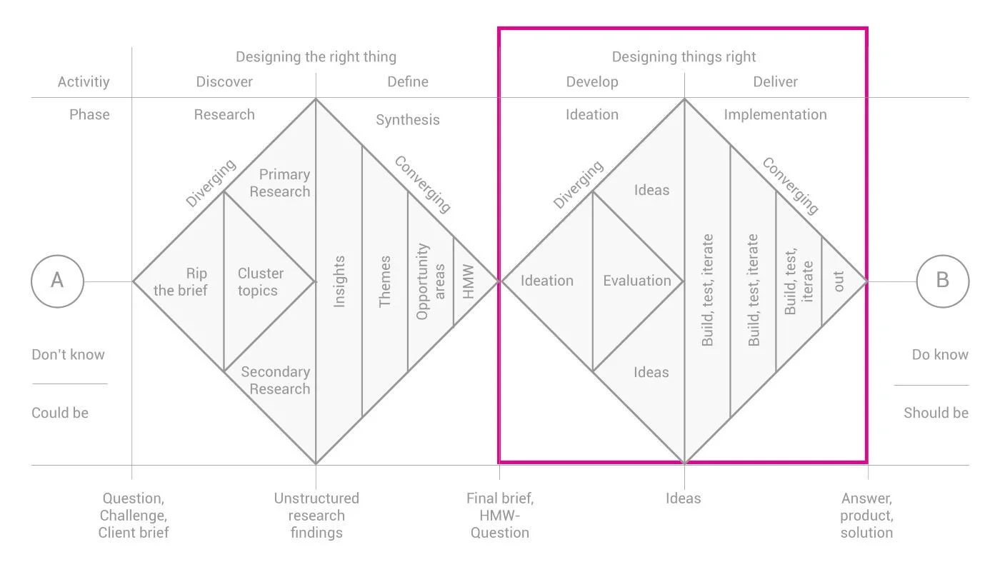
My Process
-
Building upon our established problem statement—addressing delivery errors due to postcode-based address inaccuracy—we delved into the second diamond of the Double Diamond process with a clear focus on solution development and validation.
-
We initiated the second diamond by brainstorming various solutions aimed at improving the accuracy of address input and reducing checkout errors. Our team explored different concepts, considering factors such as usability, feasibility, and alignment with user needs identified through previous research.
-
With promising ideas in hand, we swiftly moved into the prototyping phase. We developed both low-fidelity and high-fidelity prototypes to visualise and refine our concepts. This iterative process allowed us to test and iterate quickly, ensuring that our designs were intuitive and effective in addressing the identified pain points.
-
We conducted two A/B tests:
Address Autocomplete on Search Page: Compared address autocomplete with postcode-only entry.
'I'll Collect' and 'Deliver to Me' Tabs on Search Page: Compared tab implementation with CTAs.
Both tests showed a negative impact on the collect conversion rate, leading to usability tests for deeper insights.
-
We conducted three usability tests:
Address Autocomplete on Search Page: Compared address autocomplete with postcode-only entry.
'I'll Collect' and 'Deliver to Me' Tabs on Search Page: Compared tab implementation with CTAs.
Delivery Wait Time Comparison Feature: Discovering that delivery wait time and cost heavily influenced customers in the first two usability tests, we developed a new UI feature allowing them to compare delivery times on the restaurant results page.
Analysing the Current Experience
Understanding the current user experience in detail is essential to addressing this problem effectively.
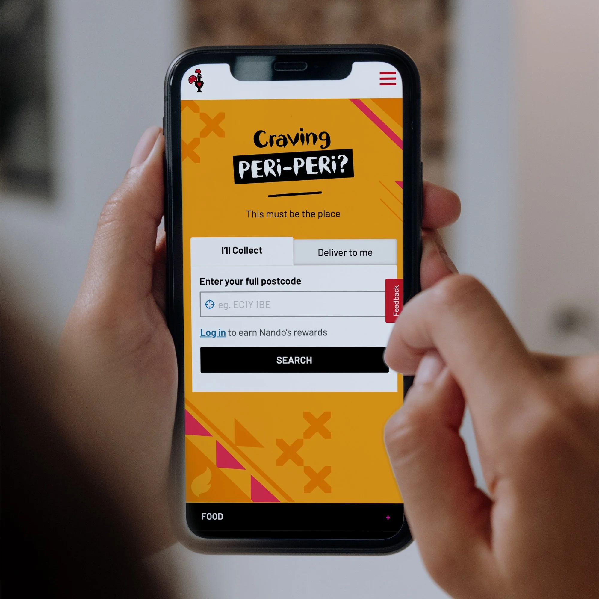
Search Page:
Users start the ordering process by entering their postcode on the search page.
The search page uses the postcode to approximate the user's location.
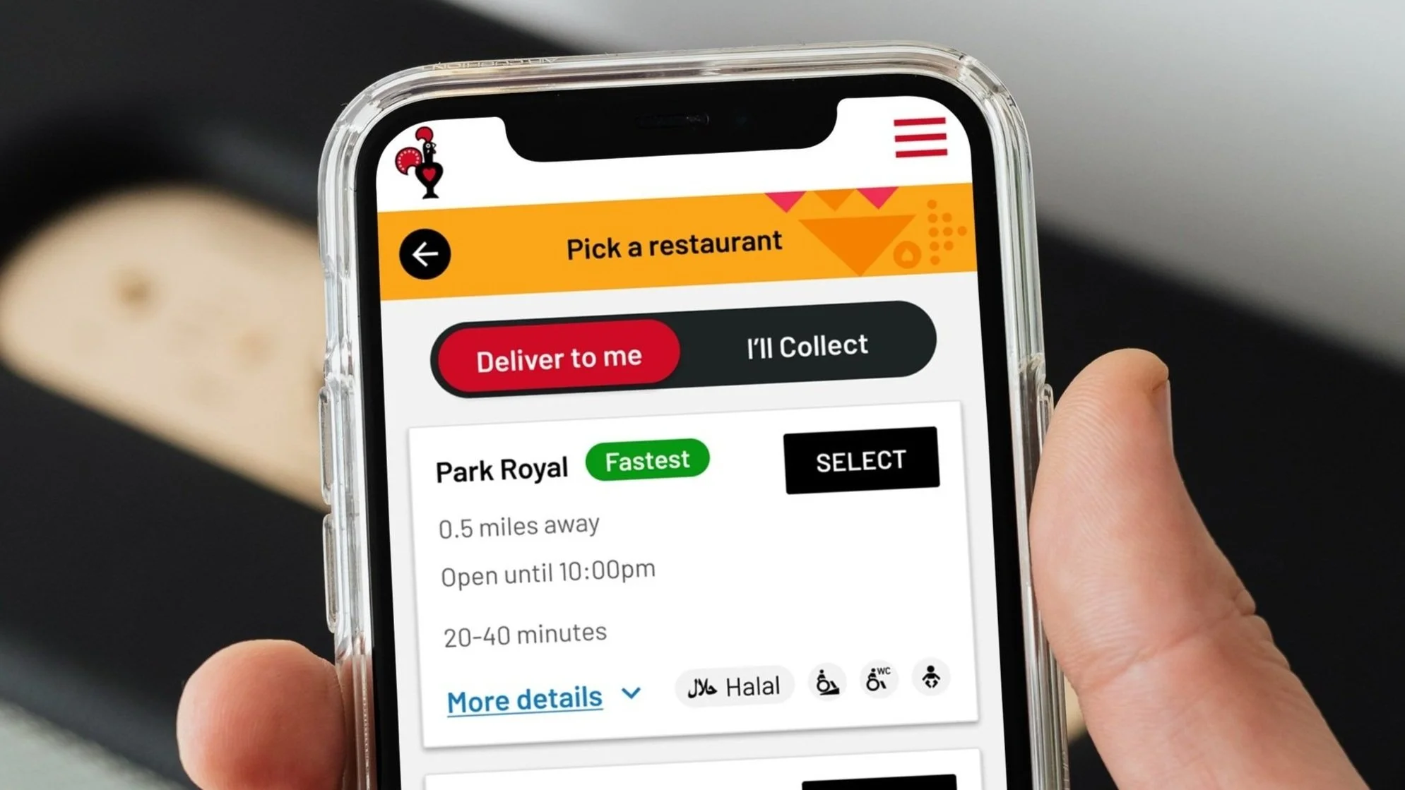
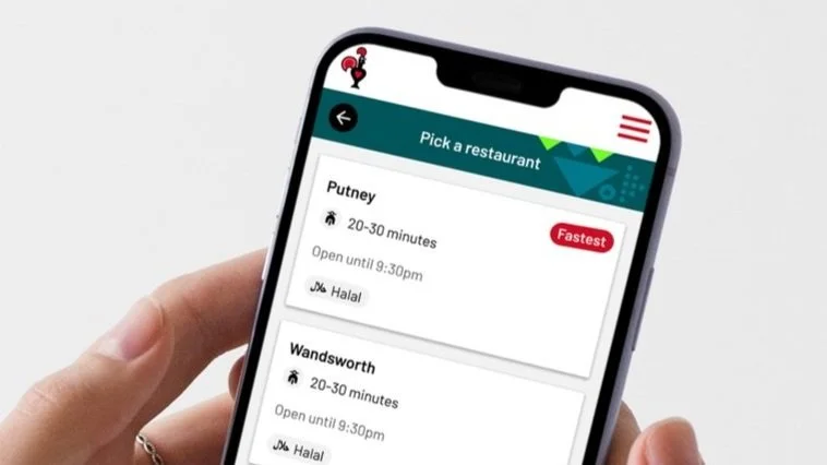
Finding Restaurants:
Users are presented with a list of restaurants based on the approximate location derived from the postcode.
They select a restaurant from the list to explore menu options.
Menu Selection:
Users navigate through the menu to select items for their order.
Current Flow
Adding to Basket:
Selected items are then added to the basket as users continue browsing the menu.
Checkout Process:
Users proceed to checkout after finalising their order in the basket.
They now enter their full address during checkout using our address autocomplete feature, which can lead to inaccuracies and undeliverable messages due to postcode-based location approximation.
Current Flow
Error Message:
A number of users may encounter an undeliverable error message if the full address entered during checkout does not match the expected delivery area.
Current Checkout Error Message
By analysing each step of the current process, we can identify the specific pain points and inefficiencies that lead to these issues. This understanding will guide the development of targeted design solutions to enhance the overall user experience and reduce checkout errors.
Hypothesis
By implementing the address autocomplete feature on the search page, customers can input their precise location early in the ordering journey. This approach ensures that when customers reach the checkout stage, their initially entered address will automatically populate, eliminating redundant data entry and simplifying the checkout process. With the accurate address provided by the autocomplete feature, customers will feel more confident about placing their order, knowing that their delivery details are accurate and will facilitate a smooth ordering experience.
Proposed New Design
🚀 A/B Testing
We conducted two A/B tests to evaluate enhancements to our current address search process:
A/B Test 1: Address Autocomplete on Search Page
We compared the effectiveness of introducing an address autocomplete feature on the search page versus our current postcode-only entry method. The objective was to improve address accuracy upfront during delivery detail input and verify deliverability.
A/B Test 2: 'I'll Collect' and 'Deliver to Me' Tabs on Search Page
We tested the usability of implementing 'I'll Collect' and 'Deliver to Me' tabs on the search page to streamline user selection between collection and delivery options.
Project Focus and Metrics
-
⬇️ Complexity Reduction: Simplify the ordering process.
⬆️ Improve Conversion Through Search: Increase successful orders from the search page.
⬇️ Reduce Checkout Abandonment: Enhance address search accuracy early in the journey to reduce abandoned orders.
-
1️⃣ Primary Metric: Search CTA Clicks
2️⃣ Secondary Metric: Bounce Rate (Abandonment)
3️⃣ Tertiary or Guardrail Metrics: Restaurant Search Results Load Time, Delivery and Collect Conversion Rate & Revenue, Time on Search Page
A/B Test 1: Address Autocomplete on Search Page
A/B Test Plan:
The test split the features into control and variant for measurement. The test was set to run 50/50 with a 70% excluded audience, targeting 30% of our total audience.
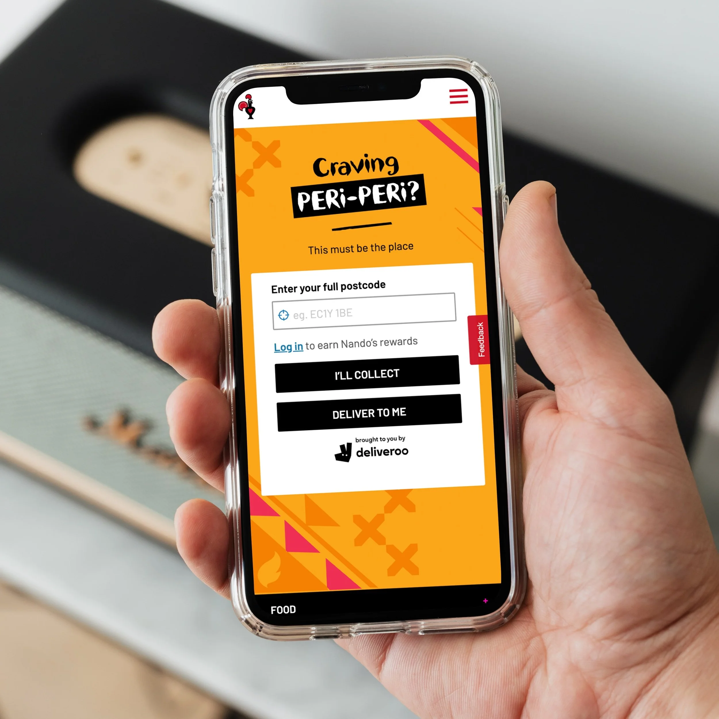
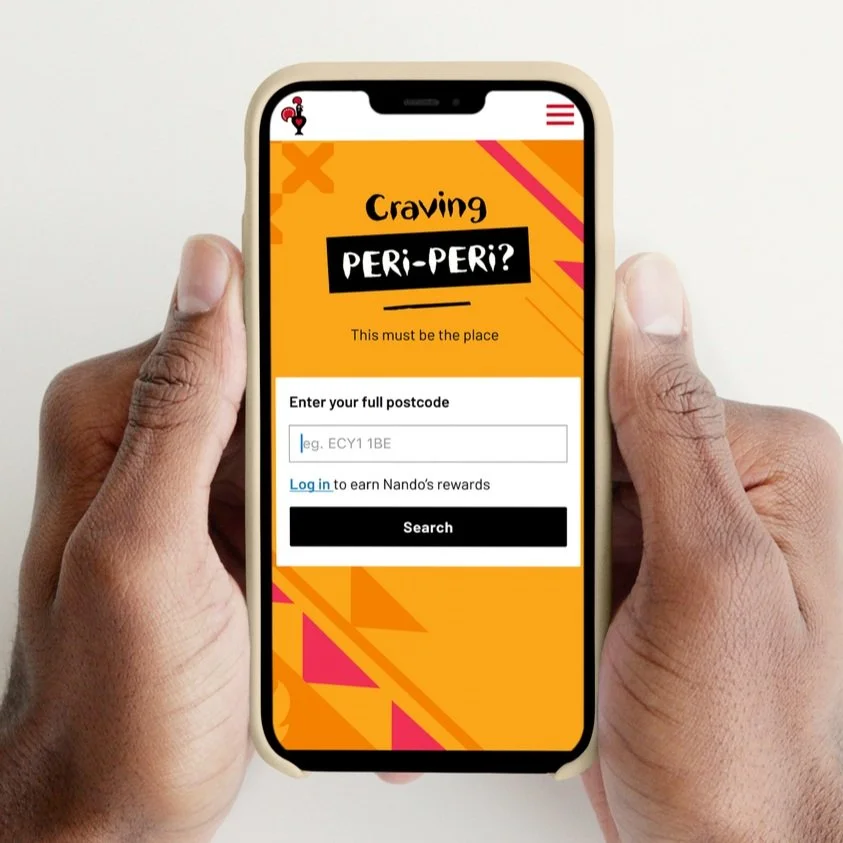
For the Control:
Customers would see the default postcode feature on the search page.
Customers can use the “locate me” icon as an alternative to entering a postcode.
Customers would see the default checkout autocomplete feature on the checkout.
Customers would not see the pin drop map in the checkout.
For the Variant:
Customers would see the search autocomplete feature on the search page.
The “locate me” icon is not included in the autocomplete feature.
Customers would see the checkout autocomplete feature in a complete state.
Customers can edit their address and will see the default checkout autocomplete feature.
Customers will see the pin drop map in the checkout.
Ireland is excluded from the test due to limited data in this region from Woosmap.

Success Metrics:
Delivery:
Conversion rate measured from Search Page ➡️ Post Order Page
Conversion rate measured from Checkout ➡️ Post Order Page
Collection
Conversion rate measured from Search Page ➡️ Post Order Page

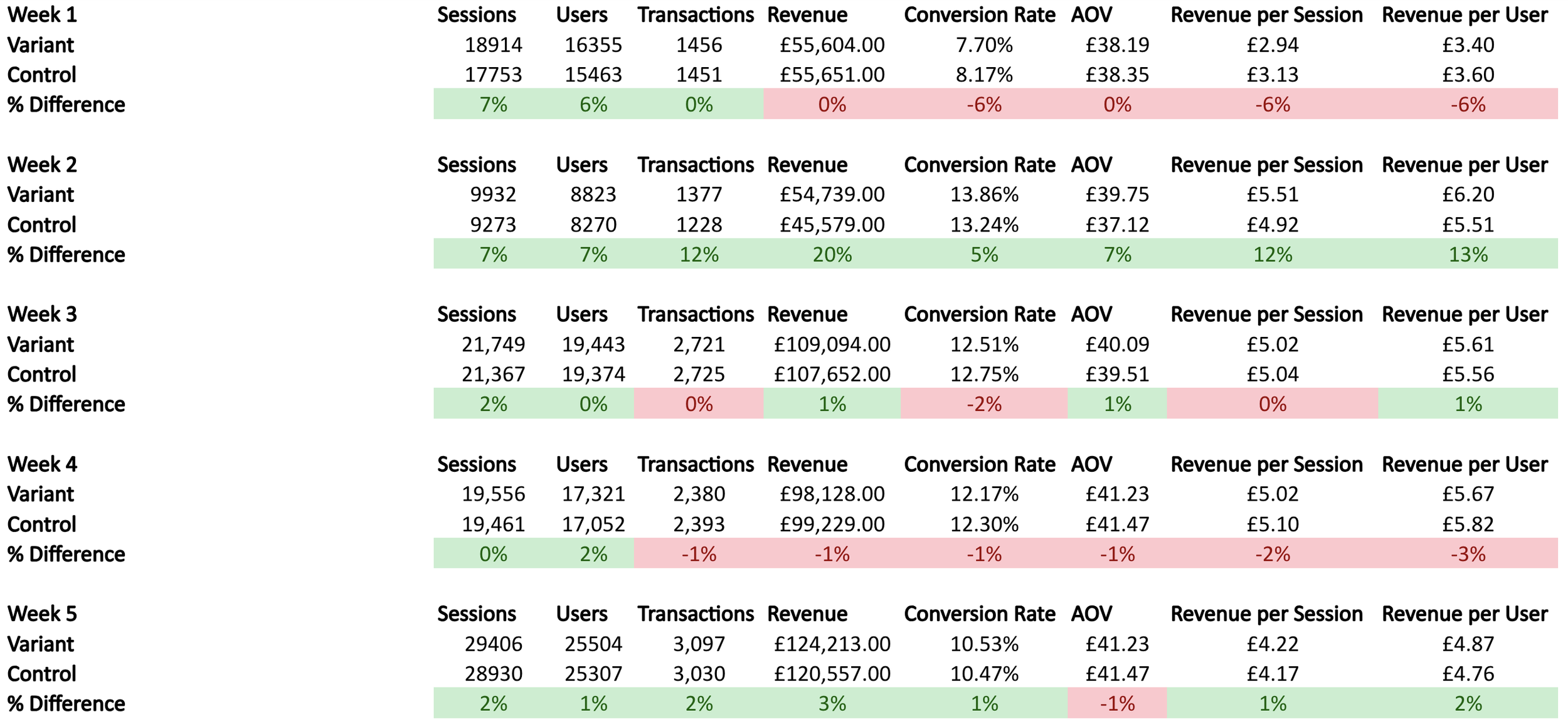
A/B Test 1: Results
-
Metric Tracking: Conversion rate measured from Search Page ➡️ Post Order Page
The metric indicates a similar experience for Collect customers - conversion from the search page is lower with the variant.
Observing that it’s not nearly as consistently impactful, due to the nature of a delivery address being a requirement to place an order for that fulfilment.
Conversion Rate (from Week 7):
→ Control: 11.49%
→ Variant: 11.27%
→ Difference: -2%
Average Difference in Conversion Rate (across the whole test):
→ Difference: -1.2%
Revenue Per Visitor (RPV) (from Week 7):
→ Control: £4.99
→ Variant: £4.89
→ Difference: -2%
Total Revenue (from Week 7):
→ Control: £290,250.00
→ Variant: £287,685.00
→ Difference: -1%
-
Metric Tracking: Conversion rate measured from Search Page → Post Order Page
The metric shows a consistently lower conversion rate for Collect customers who abandon the journey on the search page.
Conversion Rate (from Week 7):
→ Control: 15.09%
→ Variant: 14.94%
→ Difference: -1%
Average Difference in Conversion Rate (across the whole test):
→ Difference: -2.6%
Revenue Per Visitor (RPV) (from Week 7):
→ Control: £5.29
→ Variant: £5.20
→ Difference: -2%
Total Revenue (from Week 7):
→ Control: £307,661.00
→ Variant: £305,992.00
→ Difference: -1%
-
Conversion Rate (from Week 7):
→ Control: 26.85%
→ Variant: 26.43%
→ Difference: -1.5%
Average Difference in Conversion Rate (across the whole test):
→ Difference: -2.22%
Revenue Per Visitor (RPV) (from Week 7):
→ Control: £10.33
→ Variant: £10.14
→ Difference: -2%
Total Revenue (from Week 7):
→ Control: £601,094.38
→ Variant: £596,612.60
→ Difference: -1%
-
Based on the above metrics, the conclusions we have drawn are:
Customers in the Collect journey are experiencing friction on the Search page when attempting to place an order using the variant, concluded from the reduced conversion rate from the Delivery - Search → Post Order Page metric.
Customers in the Delivery journey are experiencing a similar level of friction, with a slightly reduced impact, when using the variant, concluded from the reduced conversion rate from the Delivery - Search → Post Order Page metric.
Customers who are shown the Pin Drop feature in the Checkout and using the Search Autocomplete feature earlier on the Search page have less friction when checking out with the variant.
There is no evidence that the revenue generated for each delivery or collect order placed from either the Search Page or Checkout is impacted by using the variant.
-
💡 The recommendation to prove areas of the hypothesis that have not been supported in this test is to conduct a second test with a refined objective.
💡 The objective of the second test run should aim to uplift the impacted Search → Post Order Page conversion metrics.
💡 The findings and hypothesis as to what should be changed in the next test run will be detailed in a new test plan outside of this report.
💡 If the second test run is conclusive that we have successfully uplifted the variant metrics to be on par with the control when it comes to conversion from the search page, the variant should be implemented for all customers as a result of the second test run.
🚀 A/B Testing
We've completed the first of two A/B tests to evaluate enhancements to our address search process.
A/B Test 1: Address Autocomplete on Search Page
We compared the effectiveness of introducing an address autocomplete feature on the search page versus our current postcode-only entry method. The objective was to improve address accuracy upfront during delivery detail input and verify deliverability.
✅ The address autocomplete feature on the search page successfully reduced undeliverable errors in the checkout
❌ But negatively impacted the Collect channel’s conversion rate.
What next?
Next, we are exploring alternative implementations of address autocomplete to minimise impact on Collect conversion rates. Our initial approach involves testing the usability of 'I'll Collect' and 'Deliver to Me' tabs on the search page to streamline user selection between collection and delivery options:
A/B Test 2: 'I'll Collect' and 'Deliver to Me' Tabs on Search Page
We tested the usability of implementing 'I'll Collect' and 'Deliver to Me' tabs on the search page to streamline user selection between collection and delivery options.
A/B Test 2: 'I'll Collect' and 'Deliver to Me' Tabs on Search Page
A/B Test Plan
The test split the features into control and variant for measurement
For the control
Customers would see the default postcode feature on the search page.

For the variant
Customers would see the tabs feature on the search page.

Success Metrics
Primary Metric: Search CTA clicks
Secondary Metric: Bounce rate (abandonment)
Tertiary or Guardrail Metric: Restaurant search results load, Delivery and Collect CR & Revenue, time on search page
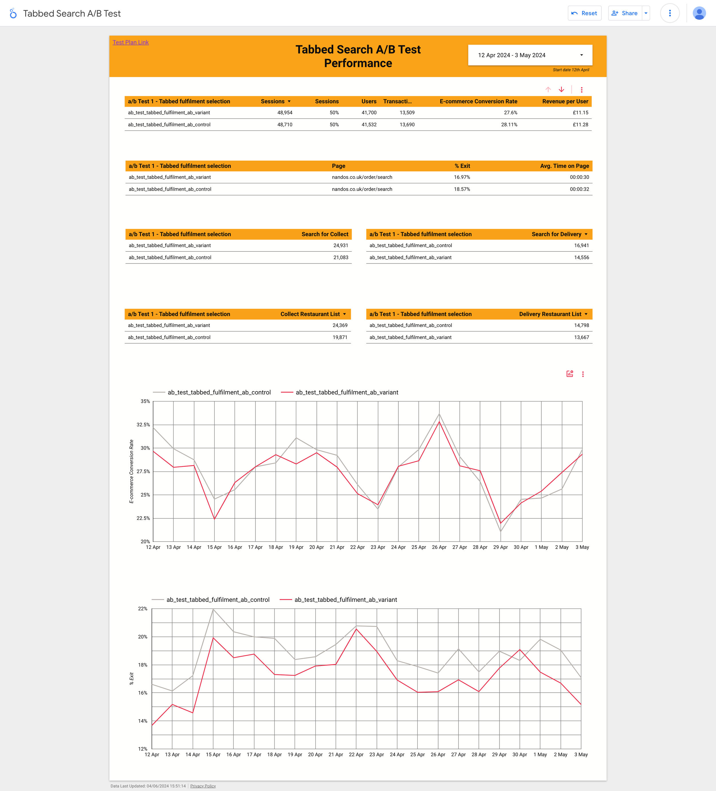
A/B Test 2: Results
-
😊 Search rate up 4% with 95% significance
😁 Collect search rate up 17% with 95% significance
😐 Delivery search rate down 13% with 95% significance
😊 Restaurant list view rate up 11% with 95% significance
😁 Collect restaurant list view rate up 22% with 95% significance
😐 Delivery restaurant list view rate down 5% with 95% significance
👀 Order conversion rate down 3% with no significance
A 3% increase in checkout abandonment for variant driving this so far
😁 Exit rate down 11%
😁 Avg. time on page down 9%
Analysis: All in all a decent first week. Our primary KPIs are significantly positive. The order conversion rate is a watch-out, but without significance. From a UX perspective the exit rate and time of page drops look like the change is effective and efficient.
The non significant abandonment at checkout is driven by collect fulfilment the hypothesis is: “people aren't seeing the "I'll collect" and just adding their postcode, searching and then getting to checkout and realising they wanted delivery”
The CVR trend being more positive over the last few days it suggests that maybe the UX change shock is easing
-
😊 Search rate up 3% with 95% significance
😊 Collect search rate up 17% with 95% significance
😐 Delivery search rate down 14% with 95% significance
😊 Restaurant list view rate up 11% with 95% significance
😁 Collect restaurant list view rate up 22% with 95% significance
😐 Delivery restaurant list view rate down 7% with 95% significance
😐 Order conversion rate down 3% with no significance
😐 Exit rate down 9%
😐 Avg. time on page down 9%
Analysis: It looks like all the metrics are consistent with the way they were trending last week. Overall, still positive in the key metrics but delivery hasn't moved in the right direction (it's the second tab so I guess this makes sense).Order conversion still showing as down.
-
😊 Search rate up 3% with 95% significance
😊 Collect search rate up 17% with 95% significance
😐 Delivery search rate down -15% with 95% significance
😊 Restaurant list view rate up 8% with 95% significance
😊 Collect restaurant list view rate up 22% with 95% significance
😐 Delivery restaurant list view rate down -11% with 95% significance
😐 Order conversion rate down -2% with no significance
😐 Exit rate down -8%
😐 Avg. time on page down -6%
Analysis: Numbers are consistent with the previous week. CVR is still not significant.
-
The negative impact on the conversion rate for the Collect channel persisted across both A/B tests.
A/B Test 1: Address Autocomplete on Search Page
Hypothesis: Customers do not want to enter their full address via the address autocomplete feature on the search page for Collect orders.
Result: The autocomplete feature successfully reduced undeliverable errors but led to a drop in Collect conversion rates.
A/B Test 2: 'I'll Collect' and 'Deliver to Me' Tabs on Search Page
Hypothesis: The preselected 'Collect' tab caused confusion, leading customers who intended to choose delivery to mistakenly start the Collect journey. These customers abandoned their Collect orders at checkout to switch back to delivery.
Result: The tab implementation negatively impacted Collect conversion rates, as many customers mistakenly entered the Collect journey and subsequently abandoned their orders.
🔄 In summary, while both experiments aimed to streamline the user experience and improve delivery accuracy, they inadvertently caused confusion and reduced conversion rates in the Collect channel. Further iterations and usability tests are needed to address these issues without negatively impacting the Collect conversion rate.
🚀 Usability Testing
Following the inconclusive results from the A/B tests, we ran 3 usability tests and a total of 30 Unmoderated Usability Tests:
Address Autocomplete on Search Page: Compared address autocomplete with postcode-only entry.
'I'll Collect' and 'Deliver to Me' Tabs on Search Page: Compared tab implementation with CTAs.
Delivery Wait Time Comparison Feature: Discovering that delivery wait time and cost heavily influenced customers in the first two usability tests, we developed a new UI feature allowing them to compare delivery times on the restaurant results page.
See our findings below👇
Observation 1: Some customers expect to see their saved address accessible on the search page.
Participant Feedback:
I can see there is a login part so if I have an account they already know my address.
Participant 1
I would be interested to see if I did log in would it then pre fill my post code.
Participant 8
Conclusion:
This insight suggests that integrating saved addresses into the user interface could enhance convenience and user satisfaction during the ordering process.
Userlytics Session
Observation: Cost and delivery wait time significantly influence customers' decisions between collecting or having Nando's delivered.
Participant Feedback:
If I thought the time was too long, I would probably want to go and collect rather than get it delivered.
Participant 3
I would like to have seen something here that said what it is to collect it because I mean it's obviously 20 to 40 minutes for delivery.
Participant 7
Conclusion:
These insights underscore the importance of providing clear information on delivery wait times and costs upfront to assist customers in making informed decisions between collecting their order or opting for delivery.
Userlytics Session
Observation: Customers express a desire to switch between delivery and pickup options after leaving the search page.
Participant Feedback:
The only thing that I say that is missing from this process would be the ability to go back and change from delivery to collection and vice versa.
Participant 2
If I'm wanting to collect or deliver, however, I would rather be able to. Well, I'm just wondering how easy it is to change to collect or deliver.
Participant 7
Although the only thing I would say is I'm not quite sure further down the line if it's gonna give you the option to change your mind.
Participant 4
Conclusion:
These insights highlight the customer expectation for flexibility in switching between delivery and collection options even after navigating away from the initial search page. This flexibility could enhance user experience and satisfaction during the ordering process.
Userlytics Session
Observation: Half of the customers expect to see a map when clicking the blue location icon on the search page.
Participant Feedback:
I was expecting to show a map pinpointing the actual address area rather than just showing a postcode
Participant 5
Yeah, it took me to a map. Ohh. I don't want to do that though. Try again. Yeah, so it took me to a map that was trying to take me.
Participant 6
I expected that to open up the maps and it did just that. So yeah, so it basically gives people an option to select their house from a map or just type it in
Participant 3
Conclusion:
These findings indicate that a significant portion of users anticipate a map interface when interacting with the blue location icon on the search page. This expectation suggests an opportunity to enhance user experience by providing a map-based interface for selecting delivery locations.
Userlytics Session
Observation: Several participants struggled to select their specific address. Some found it repetitive to click 'See All Addresses' after entering their full postcode, while others were confused by irrelevant postcodes still visible in the dropdown.
Participant Feedback:
I shouldn't have to click 'See Addresses'. It's just one extra step. I should be able to type in RG54E and select #24 from the dropdown.
Participant 3
I couldn't understand why there are different groups of postcodes that aren't mine. It showed other irrelevant addresses.
Participant 4
Conclusion:
These insights highlight the need to streamline the address selection process by minimising unnecessary steps and ensuring relevant address options are presented more intuitively.
Observation: The majority of participants expressed that entering a full address when ordering food for collection from Nando's was unnecessary.
Participant Feedback:
I suppose why would they need your full address if they're not delivering to you?
Participant 1
For collection, you don't need to know where the customer lives or what the address is, it's irrelevant.
Participant 3
The only reason I would expect to add in my address is really for billing information rather than anything to do with collecting the food.
Participant 8
Conclusion:
Participants highlighted that requiring a full address for collection orders may be perceived as unnecessary and could potentially deter users. Simplifying the input process by focusing on postcode entry for collection orders could enhance user experience and streamline the ordering journey.
Observation: Customer Expectation for Restaurants Ordered by Proximity
Insight:
The majority of participants expected the restaurants on the results page to be ordered by closest proximity.
Participant Feedback:
I expect them to show me the restaurants closest to where I live after I insert my postcode.
Participant 3
I was hoping to see nearest stores and some details about the stores.
Participant 4
I was brought from a main page to a page with a list of restaurants giving them in distance order, which is exactly what I expected was going to happen.
Participant 6
Conclusion:
Participants emphasised the importance of having restaurant listings ordered by closest proximity, as it aligns with their expectations and enhances the user experience by providing relevant information upfront. Meeting this expectation could contribute to improved usability and customer satisfaction on the platform.
Conclusion
Combining A/B testing with usability testing allowed us to comprehensively understand the impact of our design changes on user experience. These methods were crucial in identifying and addressing issues that might not have been picked up in the quantitative tests the team ran, guiding us toward a more effective solution that enhanced address accuracy and improved overall customer satisfaction.
Key Takeaway
Based on the insights gathered, it's clear that customers prioritise factors such as cost and delivery wait time when choosing between collecting their Nando's order or opting for delivery. Moreover, the requirement to enter a full address for collection orders seems unnecessary to customers, indicating a potential area for streamlining the ordering process. Additionally, customers have a strong preference for restaurants to be listed by proximity, reflecting their desire for convenience and accessibility. Lastly, the ability to seamlessly switch between delivery and pickup options post-search emerges as a key feature desired by customers, highlighting the importance of enhancing flexibility and user experience within the ordering system.
Recommendations
-
Provide users with both delivery and collection times prominently displayed on the restaurants results page. This allows users to compare the wait times for both options and make an informed decision based on their preferences and urgency.
-
Implement filtering options that allow users to sort search results based on distance from their current location or specified address. This enables users to easily identify nearby options and streamline their decision-making process.
-
Make the sorting option more prominent and intuitive. Include a dropdown or toggle switch at the top of the results page where users can select "Sort by Closest" as the default sorting option. This ensures that users who expect restaurants to be sorted by proximity can easily find and use this feature.
-
Offer users the option to filter delivery and collection times based on their preferences, such as selecting specific time slots or viewing available options within a certain timeframe. This customisation enhances the user experience by catering to individual needs and preferences.
-
Provide users with both delivery and collection costs prominently displayed on the restaurants results page. This allows users to compare the costs for both options and make an informed decision based on their preferences.
-
Show the estimated delivery time alongside the entered address on the search page, even before the user selects delivery. This gives users immediate access to important information that influences their decision-making process. It also prevents users from having to backtrack if they initially intended to choose collection but changed their mind after seeing the delivery time.
-
Ensure that the displayed delivery and collection times are dynamically updated in real-time based on factors such as order volume, kitchen capacity, and current demand. This provides users with accurate and up-to-date information, increasing their confidence in the estimated wait times.
-
Include persistent navigation options or a menu bar that allows users to easily switch between delivery and pickup options from any page within the platform. This ensures that users can make changes to their preferences seamlessly without having to backtrack to the search page.
-
Allow users to save their delivery and pickup preferences, as well as view their order history, including previous delivery and pickup selections. This personalisation feature enhances convenience and streamlines the ordering process for returning users.
-
Utilise user data and preferences to offer personalised recommendations. If users have previously indicated their location or preferred dining areas, prioritise restaurants in those areas in the default sorting order. This personalised approach can enhance user satisfaction and make the results more relevant to individual preferences.
🚀 Refinement
Refinement of Design Based on Insights
Addressing Customer Priorities:
After analysing insights from A/B testing and usability testing, we identified that customers prioritise cost and delivery wait time when choosing between collecting their Nando's order or opting for delivery.
Design Reevaluation:
In response to this key insight, our next iteration focused on enabling customers to compare wait times for collection and delivery more seamlessly.
Prototyping and Testing
With the redesigned concept in place, we developed prototypes to visualise the changes and conducted thorough testing to validate the effectiveness of the adjustments.
Iterative Design Change: Our approach involved refining the restaurants results to clearly display wait times for both delivery and collect options in a clear and comparable format. This design change aimed to provide customers with essential information upfront, allowing them to make informed decisions based on their preferences and priorities.
A/B Test 3: Delivery Wait Time Comparison Feature:
-
Test Group 1 (Control):
Users: 16,355
Transactions: 3,050
Conversion Rate: 18.63%
Avg. Order Value: £33.00
Revenue per Session: £6.25
Revenue per User: £6.82
Revenue: £102,062.50
Bounce Rate: 20%
Exited Users: 3,271
Avg. Time Spent on Search Page: 40 seconds
Test Group 2 (Variant):
Users: 16,355
Transactions: 3,300 (+250)
Conversion Rate: 20.15% (+1.52%)
Avg. Order Value: £36.50 (+£3.50)
Revenue per Session: £6.75 (+£0.50)
Revenue per User: £7.80 (+£0.98)
Revenue: £120,825.00 (+£18,762.50)
Bounce Rate: 18% (-2%)
Exited Users: 2,944 (-10%)
Avg. Time Spent on Search Page: 33 seconds (-17.5%)
-
Test Group 1 (Control):
Users: 16,355
Transactions: 3,200
Conversion Rate: 19.55%
Avg. Order Value: £34.00
Revenue per Session: £6.50
Revenue per User: £7.00
Revenue: £104,320.00
Bounce Rate: 19%
Exited Users: 3,106
Avg. Time Spent on Search Page: 38 seconds
Test Group 2 (Variant):
Users: 16,355
Transactions: 3,400 (+200)
Conversion Rate: 20.80% (+1.25%)
Avg. Order Value: £37.00 (+£3.00)
Revenue per Session: £7.00 (+£0.50)
Revenue per User: £8.00 (+£1.00)
Revenue: £119,000.00 (+£14,680.00)
Bounce Rate: 17% (-2%)
Exited Users: 2,783 (-10.40%)
Avg. Time Spent on Search Page: 38 seconds
-
Test Group 1 (Control):
Users: 16,355
Transactions: 3,250
Conversion Rate: 19.85%
Avg. Order Value: £34.50
Revenue per Session: £6.75
Revenue per User: £7.30
Revenue: £110,343.75
Bounce Rate: 18%
Exited Users: 2,943
Avg. Time Spent on Search Page: 53 seconds
Test Group 2 (Control):
Users: 16,355
Transactions: 3,450 (+200)
Conversion Rate: 21.00% (+1.15%)
Avg. Order Value: £38.00 (+£3.50)
Revenue per Session: £7.25 (+£0.50)
Revenue per User: £8.50 (+£1.20)
Revenue: £124,950.00 (+£14,606.25)
Bounce Rate: 16% (-2%)
Exited Users: 2,617 (-11.08%)
Avg. Time Spent on Search Page: 41 seconds (-22.64%)
Test Group 1 (Control):
Test Group 2 (Variant):
🚀 A/B Testing
The test results indicate that Test Group 2 outperformed Test Group 1 over 3 weeks, generating an additional £48,048.75 in total revenue and a projected annual revenue increase of £834,845.00.
Revenue From 3 Week Test
Test Group 1 (Control):
Total revenue: £316,726.25
Test Group 2 (Variant):
Total revenue: £364,775.00 (+£48,048.75)
Projected Annual Revenue
Test Group 1 (Control):
Weekly Average Revenue: £105,575.42
Annual Revenue: £5,489,921.84
Test Group 2 (Variant):
Weekly Average Revenue: £121,591.67
Annual Revenue: £6,324,766.84 (+£834,845.00)
Project Success and Next Steps
-
The project culminated in a successful final A/B test, resulting in an increased revenue of £48,048.75 over the three-week test period for the variant we designed. Furthermore, the annual projected additional revenue is £834,845.00. The new design, which enables customers to compare wait times on the restaurant results page, proved to be highly effective. This design change was directly influenced by user feedback gathered from usability tests conducted in response to the negative conversion rates observed in earlier quantitative tests.
-
With the success of the recent A/B test, the project has now reached a point where further improvements can be made. The next phase will involve running more usability tests to understand the most optimal UI approach for displaying information to users on the restaurant results page. One suggestion from the team is to remove the tabs and instead display all the cards in one list with some filtering options at the top. This marks a significant step in the project's journey towards continuous improvement and ensuring an optimal user experience.
-
The project is now focused on refining the user interface to enhance user experience and drive even better results. By prioritizing user feedback and conducting further usability tests, we aim to identify the most effective design approach that maximizes user engagement and satisfaction. This phase represents an exciting opportunity to further elevate the project and deliver an exceptional experience for our customers.
-
With a successful A/B test under our belt and a clear path forward for continuous improvement, the project is well-positioned to achieve even greater success. By remaining agile and responsive to user feedback, we are committed to delivering a user-centric solution that exceeds expectations and drives significant value for our users and the business alike.
-
Importance of Qualitative Evaluation: A key lesson from this project was the importance of pausing for qualitative evaluation after initial quantitative A/B tests. Our team noticed a decrease in collection conversion rates following the first A/B test. Despite our recommendation to pause and conduct qualitative testing to understand the issue, the engineers and tech lead proceeded with a new UI and a second A/B test without this crucial step.
Impact of Skipping Qualitative Testing: Skipping qualitative insights led to some inefficiencies and at times a slightly strained working relationship. We eventually had to run usability tests to understand what went wrong with the first two A/B tests, delaying the project and straining team dynamics.
Moving Forward: In future projects, we will balance quantitative and qualitative research to better understand user behaviour and make informed design decisions. This approach will foster a more collaborative and efficient working environment, leading to faster successful outcomes.